
Friday, January 24, 2014
Pop Print
I really enjoyed to procedure of the making the pop print in class. It was fun carving the design out and using it as a stamp to make different designs on paper. I picked a perfume bottle, which is was what I brought in for the class. I picked it because it didnt have too much detail where I would have much trouble carving out. For this project it seemed to be the more simple the carving, the better the print will end up. Unfortuantly, I didn't really like my print very much and how it turned out. I think I carved to deep and too much around the object, so when i printed, there wasnt much ink on the paper besides the outline of my carving. But, It was interesting to see my print in all different colors and patterns. If i had the chance to do this assignment again now I would know what to do differently.
Art x3
This is the art x3 project we did in class. I think this assignment really made you think about what you were going to do for your part of the collage and what it symbolized. Since there were 3 people working on one paper, you had to make your final paper look like you changed it and made it better in some way. You also had to make sure it either tied in with the previous persons work or if you wanted to ignore that and start off with a new theme, It should be somewhat meaningful. I had a hard time thinking of what I wanted mine to be about since when I got my final copy paper, all it had on it was many layers of previous work, covered by 2 layers of blue tissue paper and a large blue fish. I decided to rip off parts of the layers to reveal the older work and to take off most of the fish using sand paper. Finally I decided to take a turn in events and create a somewhat "gory" scene for my art x3 collage.

Monday, November 18, 2013
Horarding and Collecting, Andy Warhol and Patricia Munson
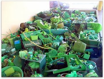
Collecting is when you save several items that mean something to you or maybe it doesn't, but I think if your a collector you should have a type of theme planned out so it will look more like art and organized. Hoarding is when you keep worthless things and many of them cluttered together and you cannot bring yourself to get rid of anything. Anyone can gather a bunch of stuff together and call it art but that's not how hoarding is. Hoarding is nothing like collecting because you don't plan on keeping things you just cant control yourself but it depends how bad your habit is, sometimes people collect trash and their house and other places because filthy, how is that art? I am comparing Portia Munson and Andy Warhol. Personally I think Andy Warhol is much more hard working than Portia is because he puts more time into his work rather than putting random things together like Portia does. The thing that they both have in common is that they have a very unique way of using color but they use color in completely different ways. But at the same time I think there work is two different types of art and Portia's at times can be more creative because many people wouldn't think about putting the types of things she puts together to make a sculpture or an instillation.


Our Class Collection & Portia Munson
I think the collection that our class collected and the sculptures/ collections that Portia Munson made showed a lot of everyday objects. One thing that I noticed that was a very popular thing in especially in Portia Munson's work was plastic. This tells us that we have a advanced technology to turn literally everything that we could need into a plastic mold or object that can soon become worthless. I saw this in Portia Munson's "Pink Project", "Lawn", and "Reflecting Pool" instillations along with some others that are similar. Both our "Blue Project" and all Portia Munson's instillations show our simple interests which are everyday objects like cleaning supplies, grooming objects, toys and other random things that aren't worth much but have a good part in the displays. Our group collection reflects some of my small interests like make up, perfume, chewing gum and some other things I use often without thinking twice about it. Below I have a picture of Portia Munson's "Lawn" and our classes current blue collection.


Friday, November 1, 2013
Bicycle drawing


compare and contrast bike and candy jar drawing


The Candy Jar
We are currently drawing a jar of candy. I am not quite finsihed yet but this was a diffucult assignment with a lot of goals you needed to hit in your drawing. Not only did it have to look like candy but it had to look like candy was inside the jar, the jar had to look like a jar, the candy in the jar had to be in the right angle, you had to shade in the shadows and highlights, and mix the colors properly using colored pencils. The hardest part of this assignment was probably making the jar look like a jar. Its getting better the more I work on it but it still needs some adjustments. The color pencils allowed you to mix with other colors to make the orignal color darker or lighter and I thought that was fun to do.


Subscribe to:
Posts (Atom)